Getting started with Basic Styling
Getting started with Basic Styling
In this episode, we will quickly go through basics of CSS.
As mentioned in the Introduction episode, CSS adds styling to the web page.
There are three types of ways of adding CSS to web page:
- Inline CSS
- Internal CSS
- External CSS
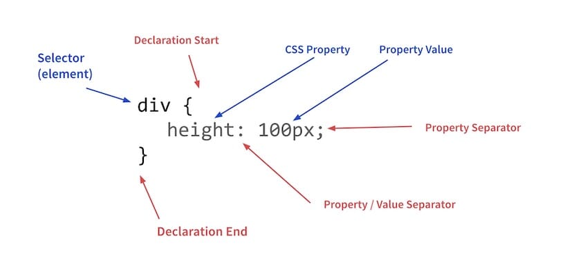
CSS Syntax
Inline CSS
-
Used to apply a unique style for a single element.
<h1 style="color:blue;text-align:center;">
  Section heading
</h1>

<p style="color:red;">
  Section paragraph.
</p>
Result
Section heading
Section paragraph.
Internal CSS
-
Include CSS rules for single HTML page and has effect within that page. It is defined in the
<head>section using<style>element.<head> <style> h1 { color: blue; text-align: center; } p { color: red; } </style> </head> <body> <h1> Section heading </h1> <p> Section paragraph One. </p> <p> Section paragraph Two. </p> </body>Result
Section heading
Section paragraph One.
Section paragraph Two.
NOTE: The benefit of Internal CSS here is that we avoid writing separate CSS for 2nd
<p>tag.
External CSS
- The CSS rules are defined in separate file with extension
.css. - Each HTML page must include a reference to the external stylesheet file (
.css) using the<link>element, inside the<head>section. -
Following line include
style.cssstyle sheet file in the web page.<link href="style.css" rel="stylesheet" type="text/css"> - The content of
style.csswill contain the CSS rules for the elements. -
Example:
h1 {
  color: blue;
  text-align: center;
}
p {
  color: red;
}
Comment
- Comment is used to explain the code which might be useful for self or for others.
- These are not displayed or rendered in the web page.
-
Syntax:
/* Write your comments here */
CSS Selectors
- A CSS selector is used to select the HTML element(s) that we can style.
- Common CSS categories:
- Simple selectors (name, id, class)
- Combinator selectors (relation between two selector)
- Descendant selector (space)
- Child selector ( > )
- Normal sibling selector ( ~ )
- Adjacent sibling selector ( + )
- Pseudo-class selectors (based on certain state)
- Pseudo-elements selectors (select and style a part of an element)
- Attribute selectors (based on an attribute or attribute value)
Simple Selectors
  /* element selector */
  p {
    color: red;
  }

  /* ID selector */
  #para {
   color: red;
  }

  /* class selector */
  .red {
    color: red;
  }

  /* specific class selector */
  /* select all <p> elements with class 'red'. */
  p.red {
    color: red;
  }
multiple selectors
-
We can specify more than one selectors to select group of elements.
#para .red {
  color: red;
}

#about h1 .center {
  text-align: center;
}
NOTE: We can have any type of selector (id, class or element) in above places.
Universal Selector
-
Selects all HTML elements on the page.
* {
  color: blue;  /* Set the color of whole page as blue */
}

/* Widely used Reset CSS */
* {
  /* Include padding and border in the element's total width and height */
  box-sizing: border-box;
  margin: 0;
  padding: 0;
}
Exercise: ‘border-box’ case
Create two boxes with same width, height, padding and border.
- Set height as 300px and width as 100px.
- Padding as 30px.
- Set border of Box 1 as
10px solid blueand other as10px solid red. - Set
box-sizingof Box 1 ascontent-box(default)while other asborder-box.
Solution
<head>
  <style>
    .box1 {
      box-sizing: content-box;
      width: 300px;
      height: 100px;
      padding: 30px;
      border: 10px solid blue;
    }
    .box2 {
      box-sizing: border-box;
      width: 300px;
      height: 100px;
      padding: 30px;
      border: 10px solid red;
    }
  </style>
</head>

<body>
  <div class="box1">Box 1</div>
  <div class="box2">Box 2</div>
</body>
NOTE: Hence
box-sizing: border-boxhas become one of important reset CSS.
Colors
Following are popular ways of specifying colors in CSS:
-
Color names
- These are specific color name like
red,aqua,chocolate,goldetc. - Know more
- These are specific color name like
- RGB (Red, Green and Blue)
- Color value is specified with combination of
rgb(red, green, blue). - Each parameter defines the intensity of the color as an integer between
0and255. - Example:
rgb(0, 0, 255)isblue,rgb(255, 0, 0)isredetc - Know more
- Color value is specified with combination of
- HEX (Hexadecimal values)
- Color is specified with hexadecimal value in the format:
#RRGGBB. RR(red),GG(green)andBB(blue)are hexadecimal integers between00andFFspecifying the intensity of the color.- Know more
- Color is specified with hexadecimal value in the format:
- RGBA (RGB with Alpha)
- Color value is specified with:
rgba(red, green, blue, alpha) alphaspecifies the opacity of the color.- Know more
h1 { color: #ff0000; } h2 { color: rgb(255, 0, 0); } h3 { color: red; } /* above are same way of getting red color */ - Color value is specified with:
CSS Units
- CSS has several different units for expressing a length.
- Following are popular units which are widely used:
px: Pixels (1px = 1/96th of 1 inch)em: Relative to the font-size of the element.rem: Relative to font-size of the root element.vw: Relative to 1% of the width of the viewport.vh: Relative to 1% of the height of the viewport.%: Relative to the parent element.
Instructor
Show the demo of different CSS units. Also, explain concepts like Viewport etc.
CSS Background
- The
backgroundproperties are used to add background effects for html elements. -
The
backgroundproperty is shorthand for following properties:background-colorbackground-imagebackground-positionbackground-sizebackground-repeatbackground-attachment
-
Shorthand syntax:
background: bg-color bg-image position/bg-size bg-repeat bg-origin bg-clip bg-attachment initial|inherit;div { background-color: #333; background-image: url("images/background.jpg"); background-position: center center; background-size: cover; background-repeat: no-repeat; background-attachment: fixed; } /* shorthand */ div { background: #333 url("images/background.jpg") center center/cover no-repeat fixed; } opacityproperty specifies the transparency of an element. It can take a value from0.0to1.0. Lower the value ofopacity, more transparent it is.- Know more
Border
- The
borderproperty allow you to specify the style, width, and color of an element’s border. - The
borderproperty is a shorthand property for the following individual border properties:border-widthborder-style(required)border-color
p { border: 5px solid red; } -
Left border can be easy created using below:
p { border-left: 6px solid blue; background-color: #ddffff; } - Know more
Margin
-
marginproperty is used to create space around all sides of element and defined outside of any borders.p { margin-top: 20px; margin-bottom: 10px; margin-right: 20px; margin-left: 10px; } /* Short hand notation */ p { margin: 20px 10px; } /* Same margin on all sides */ p { margin: 20px; } - Special case: Setting margin value to
autowill let the browser calculate the margin. Seemargin: auto. - Negative values are allowed in margin.
Padding
-
paddingproperty is used to create space around element’s content and defined inside of any borders.p { padding-top: 20px; padding-bottom: 10px; padding-right: 20px; padding-left: 10px; } /* Short hand notation */ p { padding: 20px 10px; } /* Same padding on all sides */ p { padding: 20px; }NOTE: Negative values are not allowed in padding.
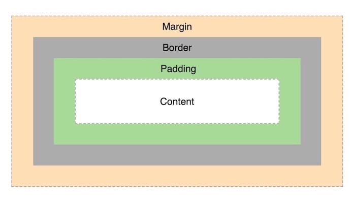
CSS Box Model
- Everything in CSS has a box around it.
- This concept is key to being able to create layouts with CSS, or to align items with other items.
-
It consists of: margins, borders, padding, and the actual content.
div {
  width: 300px;
  border: 15px solid green;
  padding: 50px;
  margin: 20px;
}

/* Create an empty div in body */
Developer Tools
Instructor
Give the demo of Developer Tools and its usage.
Text formatting through CSS
- The
coloris used to give text color. - The
text-alignproperty is used to set the horizontal alignment of a text. It can becenter,left,rightorjustify. - The
vertical-alignproperty sets the vertical alignment of an element. The values can betop,middleorbottom. - The
text-decorationproperty is used to set or remove decorations from text. - The
text-transformproperty is used to specify uppercase and lowercase letters in a text. The values areuppercase,lowercaseorcapitalize. -
The
line-heightproperty is used to specify the space between lines.p { text-decoration: underline; text-indent: 50px; letter-spacing: 2px; line-height: 30px; white-space: nowrap; } .upper { text-transform: uppercase; } .underline { text-decoration: underline; } .no-underline { text-decoration: none; }
Font
- The font adds value to your text and has huge impact on how the users experience the web page.
- It is also important to choose the correct color and text size for the font.
-
Following are common font families:
Seriffonts have a small stroke at the edges of each letter. (formality and elegance)Sans-seriffonts have clean lines (no small strokes attached). (modern and minimalistic look)Monospacehas all the letters having the same fixed width.Cursivefonts imitate human handwriting.
- The
font-familyproperty to specify the font of a text. -
The
font-familyshould hold several font names as a “fallback” system, to ensure maximum compatibility between browsers/operating systems.<p style="font-family: 'Georgia'"> The Serif Font </p> <p style="font-family: 'Verdana'"> The Sans-Serif Font </p> <p style="font-family: 'Lucida Console'"> The Monospace Font </p> <p style="font-family: 'Brush Script MT'"> The Cursive Font </p>Exercise: Different Fonts
<p style="font-family: 'Georgia'"> The Serif Font </p> <p style="font-family: 'Verdana'"> The Sans-Serif Font </p> <p style="font-family: 'Lucida Console'"> The Monospace Font </p> <p style="font-family: 'Brush Script MT'"> The Cursive Font </p>Result
The Serif Font
The Sans-Serif Font
The Monospace Font
The Cursive Font
- The
font-styleproperty is mostly used to specify italic text. - The
font-sizeproperty sets the size of the text. - The
fontshorthand property has following:- font-style
- font-variant
- font-weight
- font-size/line-height
- font-family
p {
  font: italic small-caps bold 16px/30px Georgia, serif;
}
Styling Link
- Links can be styled with any CSS property like
color,font,backgroundetc. - There are following four states of links:
a:link- a normal, unvisited linka:visited- a link the user has visiteda:hover- a link when the user mouses over ita:active- a link the moment it is clicked
a:link { color: blue; } a:visited { color: brown; } a:hover { color: red; } a:active { color: darkblue; } - Google Font
- We can use Google hosted fonts which are free to use.
- Just add a special style sheet link in the
<head>section and then refer to the font in the CSS.
<head>
  <link rel="stylesheet" href="https://fonts.googleapis.com/css?family=Poppins">

  <style>
  body {
    font-family: "Poppins", sans-serif;
  }
  </style>
</head>
CSS layout using ‘display’ property
- The
displayproperty specifies how an element is displayed in the web page. -
It is the most important CSS property for controlling layout.
display: block;  /* make the element block */
display: inline;  /* make the element inline */
display: none;  /* hide element */
Exercise: Inline Nav items
Give the code below make the nav items horizontally
<ul>
  <li><a href="#" target="_blank">HTML</a></li>
  <li><a href="#" target="_blank">CSS</a></li>
  <li><a href="#" target="_blank">JavaScript</a></li>
</ul>
NOTE:
#inhrefindicate that it points to nowhere.Solution Hint
Just add CSS to
lielement as below:li { display: inline; }
Inline Block display layout
-
display: inline-blockallows user to set a width and height on the element.NOTE: We cannot set
heightandwidthproperty indisplay: inlinelayout. -
Check the example by W3school.
Centering element, text and image
margin: autois used to center HTML element.text-align: centeris used to center text.-
display: block, margin-left/right and widthare used to center an image.img { display: block; /* required since img is inline element */ margin-left: auto; margin-right: auto; width: 300px; /* required if width size is greater than screen width */ }
width and max-width
widthproperty will prevent the block-level element from stretching to whole screen width.-
margin: autois used to horizontally center the element.Example
Here the first box has width of 600px while second box has max-width of 600px. Check by reducing the screen width.
<div style="width: 600px; margin: auto; background: lightgreen; margin-bottom: 1rem;">
  Fixed Width Box
</div>
<div style="max-width: 600px; margin: auto; background: yellow; margin-bottom: 1rem;">
  Flexible Width Box
</div>
Float and clear property
- The
floatproperty specifies how an element should float in the web page. - It is used for positioning content.
- The values for
floatcan beleft,right,noneorinherit. -
The
clearproperty specifies what elements can float beside the cleared element and on which side.Example
<style> img { float: right; } </style> <p> <img src="images/html.png" alt="User" style="width:150px;height:150px;margin-left:15px;"> This is a nice paragraph with HTML logo image on the right. </p> - The values for
clearcan beleft,right,none,both, orinherit. - When clearing floats, you should match the clear to the float i.e if an element is floated to the left, then you should clear to the left.
- Check the example by w3school.
position property
- The
positionproperty specifies the type of positioning method used for an element. -
There are five different position values:
1. static
- It is always positioned according to the normal flow of the page.
- Static positioned elements are not affected by the top, bottom, left, and right properties.
2. relative
- Element is positioned relative to its normal position.
-
The top, right, bottom, and left properties will decided the movement of element.
Example
This is normal text and has default position which is 'static'
This div element is positioned 20px from top side of its normal position.3. absolute
- Positioned relative to the nearest positioned ancestor.
- Uses document body if there is no positioned ancestors.
NOTE: A “positioned” element is one whose position is anything except static
Example
This div element has position 'relative'.This div element has position 'absolute'.
4. fixed
- Positioned relative to the viewport
- It always stays in the same place even if the page is scrolled.
- The top, right, bottom, and left properties are used to position the element.
- Check the example in w3school.
5. sticky
- Positioned based on the user’s scroll position.
- Element toggles between relative and fixed, depending on the scroll position.
- It is positioned relative until a given offset position is met in the viewport and then it “sticks” in place like fixed element.
- Check the example in w3school.
Overlapping Element (z-index)
- The
z-indexproperty controls the vertical stacking order of elements that overlap. - It controls which element should appears physically closer to you.
- It only affects elements that have a position value other than static (the default).
-
Following image will help you understand the overlapping concept.
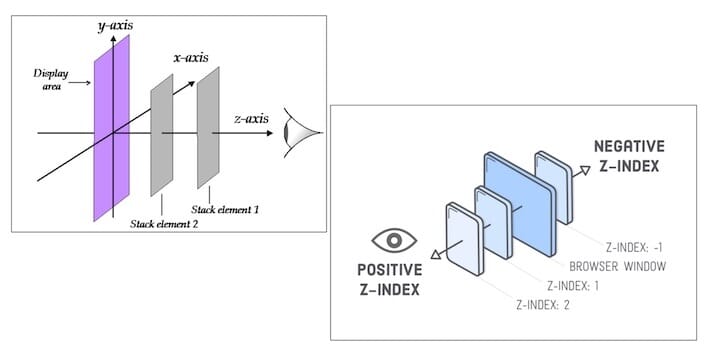
- The higher the value of
z-index, closer it will to your eyes. -
It is possible that two elements can overlap each other like in below case:
<style>
img {
  position: absolute;
  left: 0px;
  top: 0px;
  /* CSS here */
}
</style>

<h1>This is a heading</h1>
<img src="images/user.png" width="100" height="140">
<p>
  This is paragraph and the image get overlap to it.
  To fix it, you need to add 'z-index; -1' to 'img' tag.
</p>
Exercises
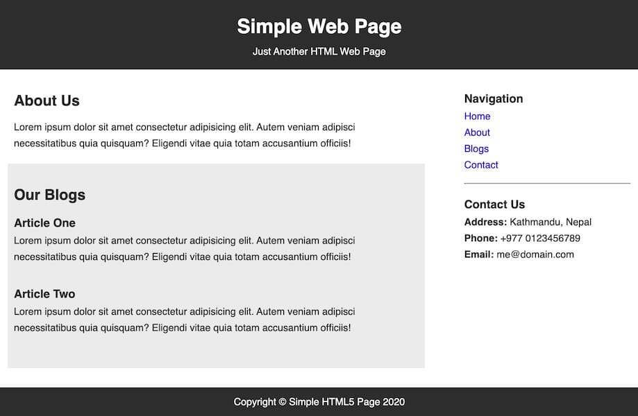
Exercise: Sample Web Page
- Open the CodePen link.
- Click on
Forklink at the bottom right corner.- Update the CSS panel as per the instructions given.
Output preview
The web page should look like below:-
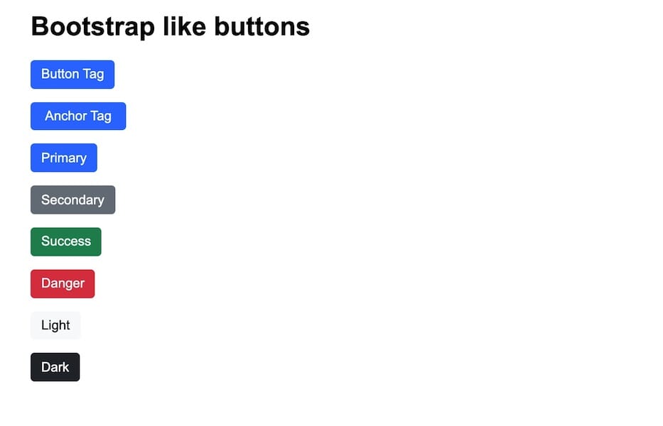
Exercise: Bootstrap like buttons
- Open the CodePen link.
- Click on
Forklink at the bottom right corner.- Update the CSS panel as per the instructions given.
Output preview
The web page should look like below:

Help me to improve Gorkha Dev.