Working with flex layout
Learn how to use flex layout to display elements in the web page
In this lesson, we will learn about the modern layout in HTML i.e flex layout.
Following are some of the importants points regarding flex layout:
- The Flexbox Layout (Flexible Box) aims to provide a more efficient way to layout, align and distribute space among items in a container, even when their size is unknown and/or dynamic (thus the word “flex”).
- The main idea behind the flex layout is to give the container the ability to alter its items’ width/height (and order) to best fill the available space.
- A flex container expands items to fill available free space or shrinks them to prevent overflow.
- The flexbox layout is direction-agnostic layout. It is a single direction layout concept.
-
The following image will help understand the main idea behind the flex layout.
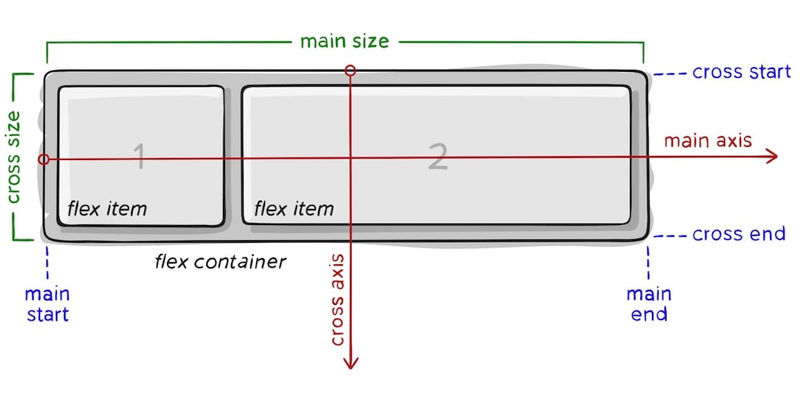
where:
main axis: The main axis of a flex container is the primary axis along which flex items are laid out. Beware, it is not necessarily horizontal; it depends on the flex-direction property (see below).main-start | main-end: The flex items are placed within the container starting from main-start and going to main-end.main size: A flex item’s width or height, whichever is in the main dimension, is the item’s main size. The flex item’s main size property is either the ‘width’ or ‘height’ property, whichever is in the main dimension.cross axis: The axis perpendicular to the main axis is called the cross axis. Its direction depends on the main axis direction.cross-start | cross-end: Flex lines are filled with items and placed into the container starting on the cross-start side of the flex container and going toward the cross-end side.cross size: The width or height of a flex item, whichever is in the cross dimension, is the item’s cross size. The cross size property is whichever of ‘width’ or ‘height’ that is in the cross dimension.
-
To define a flex container, you need to set
displaytoflex..container { display: flex; }
Example
<style>
.flex-container {
  display: flex;
  background-color: steelblue;
}

.flex-container > div {
  background-color: #eee;
  margin: 10px;
  padding: 20px;
  font-size: 30px;
}
</style>
<div class="flex-container">
  <div>Box 1</div>
  <div>Box 2</div>
  <div>Box 3</div>
</div>
Flex properties
Following are different type of commonly used properties for parent i.e flex container.
-
flex-direction:.container { flex-direction: row | row-reverse | column | column-reverse; } - Flexbox is a single-direction layout concept.
-
The items are laying out either in horizontal rows or vertical columns.
-
flex-wrap:.container { flex-wrap: nowrap | wrap | wrap-reverse; }- By default, flex items will all try to fit onto one line.
- We can change that and allow the items to wrap as needed with this property.
-
flex-flow:.container { flex-flow: column wrap; }- It’s a shorthand for the
flex-directionandflex-wrapproperties.
- It’s a shorthand for the
-
justify-content: This defines the alignment along the main axis..container { justify-content: flex-start | flex-end | center | space-between | space-around etc; } -
align-items: It defines the default behavior for how flex items are laid out along the cross axis on the current line..container { align-items: stretch | flex-start | flex-end | center | baseline etc; } -
align-content: This aligns a flex container’s lines within when there is extra space in the cross-axis, similar to how justify-content aligns individual items within the main-axis..container { align-content: flex-start | flex-end | center | space-between | space-around | space-evenly | stretch | baseline etc ; } - Know more about in w3school.
- Check this CSS-Tricks guide on Flexbox.
Following are different type of commonly used properties children i.e flex items.
-
order:.item { order: 5; /* default is 0 */ }- The
orderproperty controls the order in which they appear in the flex container.
- The
-
flex-grow:.item { flex-grow: 2; /* default 0 */ }- This defines the ability for a flex item to grow if necessary.
- It dictates what amount of the available space inside the flex container the item should take up.
-
flex-shrink:.item { flex-shrink: 3; /* default 1 */ }- This defines the ability for a flex item to shrink if necessary.
-
flex-basis:.item { flex-basis: size | auto; /* default auto */ }- Specifies the initial length of a flex item.
Example Snippets
Show example of flex box behavior. Take help of following code snippets.
Code Snippets
.item-wrapper {
  flex-direction: row;
  display: flex;
  align-items: center;
  justify-content: center;
  height: 300px;
  background-color: #eee;
}
.item {
  width: 200px;
  padding: 20px;
  background-color: #333;
  margin: 10px;
  text-align: center;
  border-radius: 5px;
  color: #fff;
  /* flex-grow: 1; */
  /* flex-shrink: 0; */
}
.item1 {
  /* flex-shrink: 0; */
  align-self: flex-start;
}
.item2 {
  /* flex-grow: 1;
  flex-basis: 0; */
}
.item3 {
  /* flex-grow: 2;
  flex-basis: 0; */
  align-self: flex-end;
}
<div class="item-wrapper"> <div class="item item1"> Item 1 </div> <div class="item item2"> Item 2 </div> <div class="item item3"> Item 3 </div> </div>

Help me to improve Gorkha Dev.